.svg)

But this simple guide is not only for designers, if you are a business owner looking for a software house for your app creation, follow these few steps to gain a better understanding of the topic!
Know the difference between desktop and mobile app design
Sometimes we forget that a smartphone is not a small desktop. You can’t just redraw the same screens you have on the desktop version of the product for mobile without damaging the usability.
Each design decision should be considered by taking into account the characteristics of the device on which the app will be used. In the case of responsive websites, we usually redo a given screen on desktop or mobile (depending on whether the project is created as a mobile or desktop first). However, in a native application, we should make better use of the device's capabilities.
When do you use your mobile device? That’s another issue to consider. Probably on the way, in random places, such as a bus or a queue. While you use a desktop computer with a specific goal, ready to invest more time. These are completely different mindsets. You have to take into account the situation, the day and its time, and even the surroundings. Will the app be used at home or outdoors? Is there a risk of light blinding the screen or maybe the app can’t be too bright, because it will be used in the car?
Also, unless you own Facebook, the time users spend with your app is very limited. That’s why you shouldn’t forget to...
Optimize the flow to the medium you use
Hierarchy of information is essential on mobile devices, as there is limited space on the screen. You need to show the main app functionality immediately and avoid the confusion. Users often have to quickly accomplish one core function in a mobile app and all the extra stuff doesn’t matter to them.
When designing each screen, focus on users’ key goals, make the primary function most noticeable and remove all obstacles from their way.
Also, remember that on mobile some tasks are much more difficult than on a desktop. For example, filling in a form. They should be designed clear and simple. Instead of making the form super long as you might do on a desktop, break it down into a flow of steps so that each screen contains only a small amount of information. In a perfect world: with as little scrolling as possible.
Know the rules, mobile app design for the operating systems
Designing for different operating systems (iOS and Android) is another challenge:. There was a time when they were very different in many ways, but in recent years these differences have changed from functional into more aesthetic. And with the increase of cross-platform technologies popularity, the border between OS’s is even thinner. I would, therefore, dare to say that by omitting selected cases, it’s ok to have an app that looks pretty much the same on both iOS and Android. That said, don’t underestimate the patterns and user’s habits. You don’t want your app to be unintuitive and feel weird.
Get to know both platforms, be aware of what is essentially native in both of them. Start with reading the Material Design and the iOS Human Interface guidelines – they’re a great source of information for mobile designers. If you’re an Android user on a daily basis, borrow an iPhone (and vice versa) and use it for at least a couple of days. No amount of screenshots and guidelines pages can replace the experience of actually using an OS. Check out popular apps and see what differences are noticeable across platforms.
In the end, it’s up to you if you want to design a completely different UI experience for iOS and Android, or just make a few basic adjustments. Mind the technology limitations and possibilities and the time you have for the app design and development.
And when you start to feel comfortable in OS guidelines, don’t hesitate to break them. The current capabilities of smartphones are huge, we have room for experiments, but you need to have a solid foundation to know where exactly it is.
Design for fingers
Speaking of guidelines. Especially if you start mobile app design having mainly web design experience, this topic may be new to you. Apart from the size of the screen, the smartphone also has parameters regarding the reach of the hand and the size of the fingers. It’s important to make controls big enough so they’re easy for users to tap.
What’s more, don’t forget about big screens. With the release of the iPhone 6 smartphones become bigger and bigger. According to research by Steven Hoober, 85% of users utilize their phone with one hand. The following heat map shows the thumb zones for every iPhone display size since 2007.
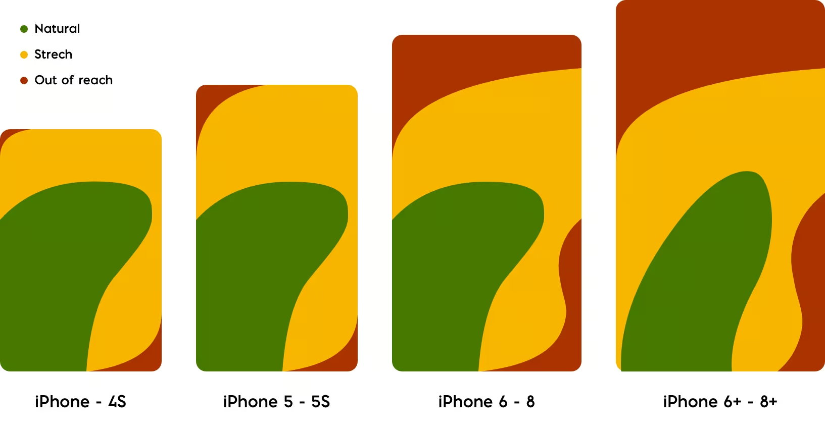
The larger the screen is, the less accessible the app is. . How to design for this size? Place the most frequently used actions in the green zone of the screen, which is comfortably reached with a thumb. Place destructive actions (such as delete) in the red zone, where it is harder to accidentally tap them.
And one last thing...
My last advice applies to both desktop and mobile design: use your product constantly! I can’t emphasize it enough. You can spend months on tailoring the perfect UI, but the truth is, you need to click through the working app to truly understand what’s missing in the user experience, find bugs you were not aware of, make the flow even better.
As you’ve probably noticed, this article won’t give you a tip for ideal mobile app design, and the reason is simple - such a guide doesn’t exist. But I think I gave you a few simple tips that can help improve your everyday work and make your designs even better. And if you’re not a designer, knowing these few basics you will be able to have better control and knowledge on the way your app is designed.


.svg)
.svg)
.svg)
.avif)

.avif)
.avif)
.avif)