.svg)
.webp)
We all tend to get excited about the new front-end technologies that keep coming in. Just think about the latest version of React, finally seeing masonry (or the holy grail layout, as it was called back in the days) in the CSS Grid spec, or all the new and shiny libraries being released… Some classic oldies stepping down can send just as big shivers down our front-end spines. This time, however, I won’t be discussing any groundbreaking news. Instead, I’ll take you back to the basics of using color in CSS. Yep, you read that right, color.
Back to basics: RGB color model
Let’s go back in time, shall we? I think it’s safe to say it all started the same for most of us: with right-clicking on a web page and seeing the mysterious inspect element item in the context menu. After spending some time exploring the developer tools, you notice the color property applied to some HTML elements. You click on it, and whoa, you can change the color of the text!
You mostly see a series of mysterious strings like #234669, #FF4E00, #FF0000, #1CE1CE, and so on. As an eager to learn soon-to-be developer, you first experiment with the colors. Then, you continue reading on the mysterious hexadecimal representation in the RGB color model. Soon, you get a basic hang of it with the help of color pickers. And usually, that’s it.
You know it’s an additive method of mixing colors: you have a triplet of numbers represented in the hexadecimal system, with each component representing a value of the three primary colors, red, green, and blue, respectively. The higher the number in each pair, the more of each component you get. #000 lacks all of the primaries, so you know it has to be black. #FFF is an equal mix of all the full primaries, so that’s white. That’s the gist.
Now you know that #FF0000 (you even get to know the shorthands, so #F00 is enough) gives you the reddest red, #00FF00 the greenest green, and so on. You learn some basic combinations of the primaries, e.g., mixing red with green gives you yellow, #FF0 in shorthand. #F0F stands magenta, while #0FF is for cyan… or aqua. Whatever, names are vague, and as engineers, we prefer explicit. You also learn that it’s possible to add a fourth number representing the alpha channel, or the color’s opacity. So #0000FF7F will be an intense blue with half opacity. By the way, all of those are 8-bit colors, so we get just 255 values per channel. I think we’re still years before wide color gamuts and 10-bit depth get broader adoption in computers, as they did in TVs a few years ago.
What we’ve said so far is simple, right? But what if we go into more nuanced colors, like #42304C. What the hell is that? Let me check… Ok, that’s a dark-ish purple-ish thing. How about #E67609? Let’s split that up. It seems like a lot of red, a little less than half of green, and just a tad of blue. Let’s check by pasting the code into a color picker/mixer tool. Just about right, it’s a sort of dark orange. Now let’s take a look at #5AFD03. Some red, lots of green, next to no blue. But what the hell do you get from mixing lots of green with some red? I need to check that as well… and it turns out to be just brighter green.
What I’m trying to show you here is that although RGB hex is fine for doing some basic additive color science and has a very gentle learning curve, it’s not really that intuitive when it comes to colors other than the basics (or some you’ve learned & remembered). Sure, we can simplify it by using decimals instead of hexadecimals with the rgb() color function in CSS, so the dark purple becomes rgb(66, 48, 76), the dark orange becomes rgb(230, 118, 8), and so on. Then, rgba() allows us to specify the alpha channel as well. In fact, thanks to the CSS Color Module Level 4 spec, soon we won’t have to use a separate rgba() function anymore – we’ll just supply the alpha channel as an optional fourth argument to rgb(). In such a scenario, our half-opaque intense blue becomes rgb(0, 0, 255, 127). As you don’t have to do the HEX-DEC conversion in your head, it becomes a bit simpler but not really much more intuitive.
📚 Only getting started? Read what it takes to become an exceptional Frontend Developer!
Enter HSL, an alternative to RGB
What if, instead of mixing colors, we took a different approach? What if we could express colors as a fraction of the entire color spectrum? What other ways are there to describe colors instead of mixing light at different wavelengths?
Let’s take a break for a little thought experiment. Think of a color, maybe that of the November sky in Poznań. I have in mind something gray-ish, blue-ish, and not-too-bright. Now, let’s break that into pieces. It’s a sky blue hue. It’s gray-ish, so not very saturated, but not as gray as London in the 1960s. The lightness is somewhere near the middle. Got it? And that’s where HSL steps in.
Most of us know the order of the colors corresponding to the wavelengths of the light spectrum: red, orange, yellow, green, blue, indigo, violet. You know, the way they teach us in primary school, the good old Mr. Roy G. Biv, the lovely rainbow 🌈 The good news is, the position of a given color on the color wheel is basically the only thing you really need to learn about HSL. To make things even easier, we’ll stick to this cheatsheet for now. Since we’re talking about the color wheel, the position is represented by degrees. For simplicity, the degrees are implied, so the deg suffix is optional.
Hue, saturation, and lightness in practice
As per our cheatsheet, the color named sky blue is around 210 degrees – that’s our hue. Setting the saturation means controlling the vividness of a given color. We established that the smog level is relatively high (my asthma confirms), so it won’t be too saturated. For our example, let’s set it at ⅓ saturation, which gives us a value of 33%.
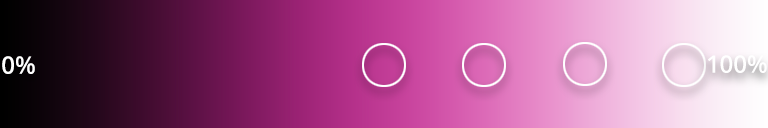
Last but not least comes lightness, also represented by a percentage. The spec defines 0% as black, 100% as white, and 50% as normal (I’m not a big fan of this word either, but that’s what the spec says). Anything below 50% means you’re adding black to your color, while anything above 50% means you’re adding white. In other words, you’re creating a new shade or tint, respectively. Since I’m writing this around 1 PM, the sun is still quite high. Even with the smog in the air, I’d say the lightness is about 60%.
Mind you, there’s one thing to remember about the syntax. Even values of 0 need to have the percentage sign, unlike some other values (such as padding, margin, etc). So if you want a fully desaturated color, you need to set the second channel to 0%.
What color are the values?
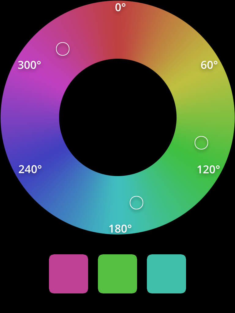
Going back to our color, we’ve got it represented by hsl(210 33% 60%). Let’s check those numbers – also, please excuse my Photoshop skills 😉 First, we select our hue – 210 degrees – from the color wheel. Next, we check the upper bar, which reflects the saturation of our color, and select 33%. Finally, we choose 60% on the lower bar, the one representing lightness.
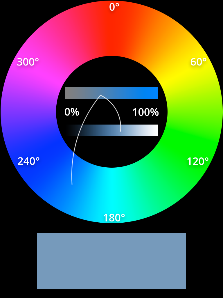
Et voilà, this is pretty close to what I see outside the window in November. Tell me now, is it more intuitive to remember the color as being around 4/7 on the color spectrum, being 33% saturated and having about 60% of lightness, or rather as a coupling of 102/255 red, 153/255 green and 204/255 blue (or 66/FF red, 99/FF green, and CC/FF blue)?
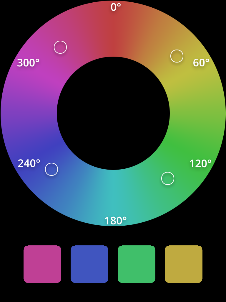
Let’s try another one. My PS4 console has a red carbon dbrand skin on it. As working remotely means you have no time for house cleaning (duh), it’s a little dusty on top. Red is placed at 0 degrees on the color spectrum, the longest wavelength of around 700nm. The dust lowers the saturation, making it a tad below half, more or less 40%. I may have taken a longer coffee break than I initially anticipated when writing this article, so it’s getting darker now, it’s around 4 PM. That brings our lightness down to 45%.
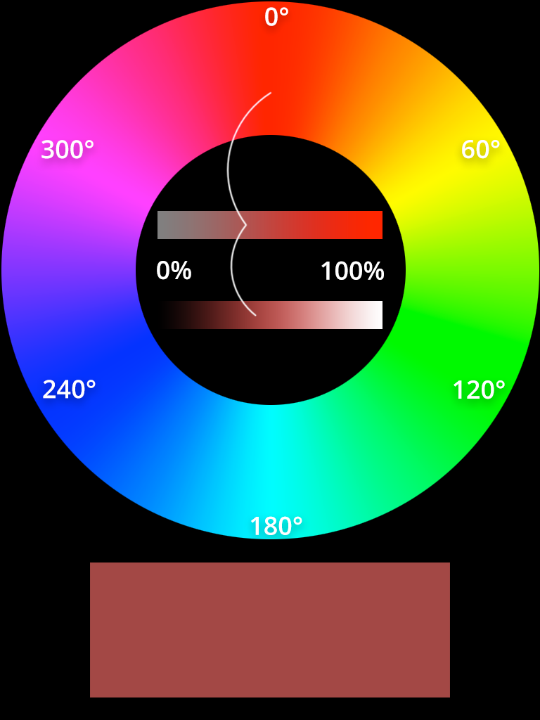
Not perfect, but pretty close. See what I’m getting at? To me, HSL seems much more intuitive than RGB.
Practical applications of HSL
At the end of the day, the notation is just a notation, isn’t it? You get a link to a project in Invision, and all the colors are in RGB, that’s it. Let us, however, think of more practical applications of HSL.
Color schemes
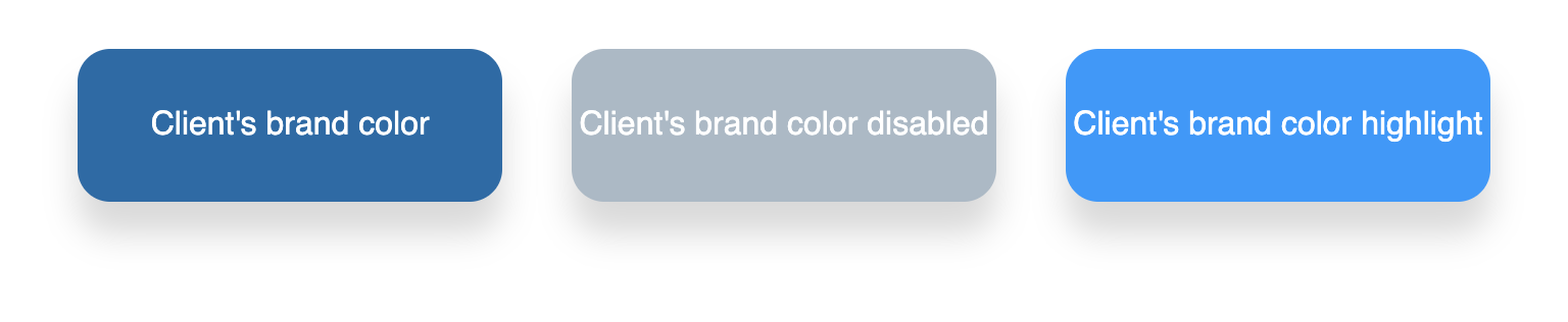
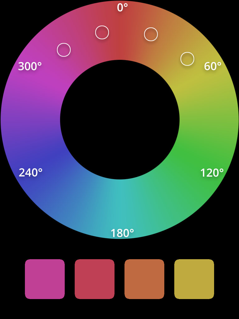
Let’s say you want to create an entire design system at the start of the project. You know, a pretty useful thing. You get a set of brand colors from the client, with the main one being #0F6BA8, which translates to a HSL value of hsl(204 84% 36%). This will be used, among other things, as an accent color for your primary buttons.
HSL allows you to create variants of the basic color in an absurdly simple way. Want to create a disabled button? Just reduce the saturation and increase the lightness – hsl(204 20% 72%) gives you a grayer variant of the same hue! Want to create a highlight version of your color for a hero element? Go all out and top the vividness of your color, then make it slightly lighter – the result is hsl(204 100% 50%). Again, a consistent hue, but much more vivid. Not to mention that it’s all in line with your client’s provided branding.
If you’re anything like me, you also like to dabble a little with designing stuff, even if you’re more of a coder. Since I never studied anything even closely related to color science (ok, I’ve had a course in optics while studying physics, but that’s not much), I usually end up picking a single color from a color picker and using online color palette generators. What if I told you HSL can help with that as well?
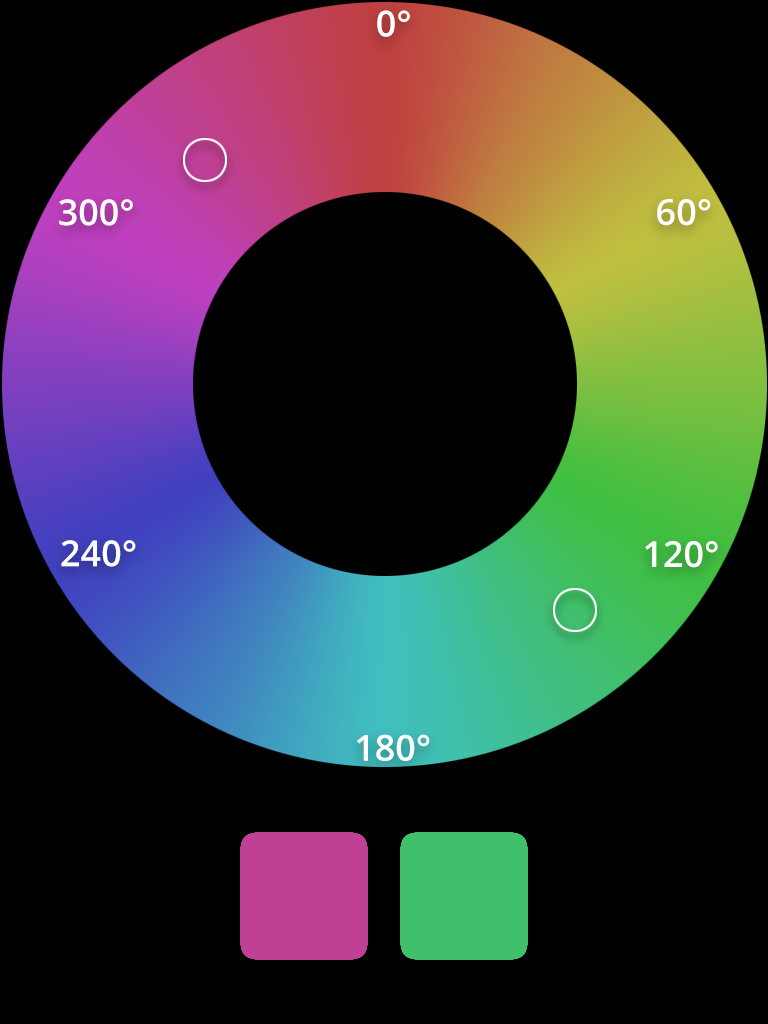
Let’s pick a random color, maybe a nice shade of pink. Nothing too saturated since we’ll be working with it for a while, hsl(320 50% 50%) will do. Now you can very easily create a complementary color by adding 180 to your current hue value. Wait a minute, 320 plus 180 is more than 360, a full angle, isn’t it? you may ask. True, but that’s not a problem for HSL. Unlike RGB, which would throw an error whenever the value larger than a decimal of 255 or a hexadecimal of 0xFF, HSL just loops around the color wheel. If you’re uncomfortable with using a degree larger than 360, you can always subtract the 180 and get 140 because hsl(500 50% 50%) gives you exactly the same color as hsl(140 50% 50%).
Now we’ve got a nice pair of colors that go together. By the way, we’ve just created a complementary color scheme.
Want more colors? Let’s go with the so-called triadic color scheme now. And you guessed it right, as the very name suggests, we’ll be picking three colors equidistant to each other.

What about a different idea, a split-complementary color scheme? Take your base hue (320), go to a complementary color (140), and add as well as subtract the same value from it. Make it 30. That gives us a split-complementary color scheme of hsl(320 50% 50%), hsl(110 50% 50%), and hsl(170 50% 50%). Or, you know, you can always go with hsl(calc(320 - 180 - 30) 50% 50%) and hsl(calc(320 - 180 + 30) 50% 50%) if that’s more your thing. HSL also accepts calc().
Want even more colors? Fine by me, let’s split the color wheel in four. This will give us a tetradic color scheme: hsl(320 50% 50%), hsl(230 50% 50%), hsl(140 50% 50%), and hsl(50 50% 50%).
Now, we’ll build an analogous color scheme. Just move the hue by a value of 30 either way on the color wheel. Starting with our base again and going clockwise: hsl(320 50% 50%), hsl(350 50% 50%), hsl(380 50% 50%), and finally hsl(410 50% 50%). By the way, see how we looped around the color wheel again?
We can also go the other way and keep the hue static while modifying the lightness. That way we’ll get a monochromatic color scheme: hsl(320 50% 50%) for our base, then gradually increasing the lightness to hsl(320 50% 63%), hsl(320 50% 76%), and hsl(320 50% 89%).
To finish off this section, here come all those previously created color schemes: https://codepen.io/khankiewicz/pen/mdEYWZN
Now for the real fun with HSL
Combining the power of HSL with CSS custom properties (aka variables), we can add a dark theme or create general theme support (more on that later) very easily. Let’s use our complementary color scheme as the base for the new theme. First, we create the custom properties:
:root {
  --hue-base: 320;
  --hue-complementary: calc(var(--hue-base) - 180);

  --color-base: hsl(var(--hue-base) 50% 50%);
  --color-highlight: hsl(var(--hue-complementary) 50% 50%);
  --color-background: hsl(var(--hue-base) 50% 92%);
}
Speaking of CSS, you might be interested to read one of these:
🔸 Tailwind CSS - compose your styles easily with utility functions
🔸 Introduction to Styled Components
Next, let’s make our document use these colors:
html {
  color: var(--color-base);
  background-color: var(--color-background);
}

.highlight {
  color: var(--color-highlight);
}
That’s our base, the light theme. Now, let’s create a simple dark theme by reducing the lightness of our initial colors:
html[data-theme=’dark’] {
  --color-base: hsl(var(--hue-base) 50% 15%);
  --color-highlight: hsl(var(--hue-complementary) 50% 15%);
  --color-background: hsl(var(--hue-base) 50% 0%);
}
Using what we’ve learned so far, we can also use the above base to simply create a high-contrast theme. Remember, if we set lightness to 100%, we’ll always get pure white, regardless of the selected hue. The same goes for setting 0% and getting black. And so:
html[data-theme=’high-contrast’] {
  --color-base: hsl(var(--hue-base) 50% 100%);
  --color-highlight: hsl(60 100% 70%); /* just a reminder - yellow is at 60° on the color wheel. So we’re setting a bright yellow as our highlight. This color placed on a black background passes the WebAIM’s contrast checker test. */
  --color-background: hsl(var(--hue-base) 50% 0%);
}
If you add a data-theme attribute with a value of dark to your html element, you’ll get a consistent dark theme. Setting the value to high-contrast, on the other hand, will give you an accessible high-contrast theme. You can play around with it over here: https://codepen.io/khankiewicz/pen/ExypXKz
Now you can keep a consistent theme while changing but a single value. Whenever you modify the value of --hue-base, you’ll end up with a consistent complementary color for your highlights. You can also easily extend this to triadic, tetradic, split-complementary, or analogous color themes by subtracting or adding the correct values to your base hue – the rest gets recalculated automatically.
Then, you can modify the lightness values while keeping the hue static for a nice monochromatic theme:
:root {
  --hue: 0;
  --hue-complementary: calc(var(--hue) - 180);
  --color-base: hsl(var(--hue) 100% 50%);
  --color-light: hsl(var(--hue) 100% 63%);
  --color-lighter: hsl(var(--hue) 100% 76%);
  --color-lightest: hsl(var(--hue) 100% 89%);
  --color-background: hsl(var(--hue) 100% 8%);
}
Using this base and modifying the --hue variable, e.g., by setting the property inline on the element, you can easily create simple monochromatic color themes:
document.documentElement.style.setProperty(‘--hue’, 60)
for a yellow theme, or
document.documentElement.style.setProperty(‘--hue’, 120)
for a lime theme,
document.documentElement.style.setProperty(‘--hue’, 270)
for a purple theme, and so on. Here’s an example of simple theme switching using HSL: https://codepen.io/khankiewicz/pen/LYZvroG
A quick reminder, you can also do simple theming using media queries instead of manual toggles. Rather than using an attribute selector in CSS, use the prefers-color-scheme media query for the dark theme:
@media (prefers-color-scheme: dark) {
  html {
    --color-base: hsl(var(--hue-base) 50% 15%);
    --color-highlight: hsl(var(--hue-complementary) 50% 15%);
    --color-background: hsl(var(--hue-base) 50% 0%);
  }
}
or even the prefers-contrast media query, although as of today, this is still a highly experimental feature:
@media (prefers-contrast: high) {
  :root {
    --color-base: hsl(var(--hue-base) 50% 100%);
    --color-highlight: hsl(60 100% 70%);
    --color-background: hsl(var(--hue-base) 50% 0%);
  }
}
Here’s a pen based on the above code: https://codepen.io/khankiewicz/pen/ZEOZEbz
Note that it’s not necessarily the preferred method. Not every user with a system/browser-wide dark theme wants to see a dark version of a website. As with most things, this is something that should be left to the user. Preferably, it should be a mix of both, perhaps an initial media query check, but with a manual toggle + storing the user’s preference in local storage or a cookie.
Are there cons of HSL?
So, are there any disadvantages of using HSL? Sure, nothing’s perfect. Besides the most obvious one, which requires you to change your habits, the one that comes to mind immediately is the inconsistent support in some major pieces of software. For example, Photoshop is based on the HSB system instead of HSL – it uses brightness instead of lightness, thus mixing the saturation values as well.
Then, HSL isn’t as commonly used as RGB, so you’ll either have to convince your team to use it or do your own conversions and risk inconsistencies in your code. Finally, this color model isn’t supported by ancient browsers like IE8, so you’ll have to decide if that’s a dealbreaker or not (or, as is always the best choice, use a fallback value). There could also be some minor variations in converting the HSL values to discrete RGB equivalents while displaying them, especially in varying color gamuts.
Final words on HSL
I hope this article helped you understand what HSL is and how it behaves, as well as how useful it can be in a variety of scenarios. Personally, HSL gives me a greater degree of control over my styles, with simpler ways of creating related colors and keeping everything consistent. Sure, it takes a while to get used to it, but isn’t that true for any other tool? I, for one, know that I’ll be using HSL on my own website. That is, whenever I get to redesigning it.
Looking for an ambitious frontend position? Check out our job openings waiting just for you!


Navigate the changing IT landscape
Some highlighted content that we want to draw attention to to link to our other resources. It usually contains a link .
.svg)
.svg)
.svg)
.avif)

.avif)
.avif)
.avif)