.svg)
.webp)
In this tutorial, we will show you how to use various types of animations in your Dart-based projects. It is a useful guide for further work with implicit, explicit, and custom animations.

Animation types in Flutter
First things first, Flutter’s API docs have a very descriptive decision tree that helps developers decide on the type of animation they need. It looks as follows:
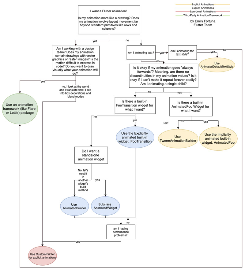
A type of animation decision tree. Source: Flutter's API docs
Looking at the diagram, we can group the types of animations in the following way:
- Implicit animations,
- Explicit animations,
- Special animations (created by Lottie, Rive, etc.),
- Custom animations (custom shapes and effects).
In this article, we will introduce you to animations, talk about concepts such as Curves, Implicit and Explicit animations, Staggered animations, leaving the Special animations for yet another time.

Implicit animations
How about calling implicit animations “cliche animations”? This particular animation type is used for simple animations which don’t require a lot of customization such as these:
If we were to generalize, anything that relies on a change in a single aspect such as size, color, position, etc. can be considered an implicit animation.
Flutter provides the animated versions of the most common widgets, in order to save the trouble of repetitive and tedious work of preparing an animated widget. Here is a list of such widgets to help you create a neat-looking animated UI.
- AnimatedContainer,
- AnimatedCrossFade,
- AnimatedDefaultTextStyle,
- AnimatedModalBarrier,
- AnimatedOpacity,
- AnimatedPadding,
- AnimatedPhysicalModel,
- AnimatedPositioned,
- AnimatedPositionedDirectional,
- AnimatedSwitcher.
You can also find a full list of built-in implicit Flutter animation widgets here.
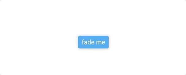
Notice how the AnimatedOpacity widget is used as an example below. The widget disappears with a fade-out in 200 milliseconds.
class ButtonFade extends StatefulWidget {
 @override
 createState() => ButtonFadeState();
}

class ButtonFadeState extends State<ButtonFade> {
 double opacityLevel = 1.0;

 @override
 Widget build(BuildContext context) {
   return Column(
     mainAxisAlignment: MainAxisAlignment.center,
     children: [
       AnimatedOpacity(
         opacity: opacityLevel,
         duration: Duration(seconds: 2),
         child: ElevatedButton(
           child: Text('fade me'),
           onPressed: () {
             setState(() => opacityLevel = opacityLevel == 0 ? 1.0 : 0.0);
           },
         ),
       ),
     ],
   );
 }
}
In the example, the animation is driven by the “opacity” value. Any change in this property leads the widget to rebuild and have a visual iteration over the past version. Different widgets have different properties that are responsible for driving the animation.
By default, these properties interpolate between 0 and 1, linearly increasing. However, we can play with them. These values can also be driven non-linearly, using Curves.

Curves
Not all animations work linearly. In fact, linear animations look quite boring compared to non-linear ones with the use of which the animation flows more naturally. Fortunately, Flutter allows us to define a mathematical curve for the interpolation of the animation value.
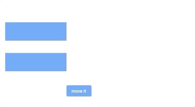
Below, you can see a sample comparison of linear and nonlinear curves.
class ButtonBounce extends StatefulWidget {
 @override
 createState() => ButtonBounceState();
}

class ButtonBounceState extends State<ButtonBounce> {
 double leftPosition = 20;

 @override
 Widget build(BuildContext context) {
   return Stack(
     children: [
       AnimatedPositioned(
           left: leftPosition,
           top: 100,
           duration: Duration(seconds: 2),
           child: Container(
             height: 60,
             width: 200,
             color: Colors.blue,
           ),),
       AnimatedPositioned(
           left: leftPosition,
           top: 200,
           curve: Curves.bounceOut,
           duration: Duration(seconds: 2),
           child: Container(
             height: 60,
             width: 200,
             color: Colors.blue,
           )),
       Positioned(
         left: 220,
         top: 300,
         child: ElevatedButton(
           child: Text('move it'),
           onPressed: () {
             setState(() => leftPosition = leftPosition <= 20 ? 400.0 : 20.0);
           },
         ),
       ),
     ],
   );
 }
}
As you can see in the gif below, it brings a more natural animation to your widget.
There are many curves in Flutter API docs that provide a wide variety of mathematical curves. But what if you are looking for something special, which is not provided by the built-in curves? Well, then you can make your own Custom Curve.
Custom Curves
Creating a custom curve is very straightforward. The tricky part is to find out which mathematical formula provides the desired effect. There are two points to follow:
- a custom curve must extend a Curve class,
- it must override the “transformInternal” method.
Here is an example of a curve that converts the linear curve into discrete steps. The effect is similar to moving objects in retro games.
class ButtonBounceState extends State<ButtonBounce> {
 double leftPosition = 20;

 @override
 Widget build(BuildContext context) {
   return Stack(
     children: [
       AnimatedPositioned(
           left: leftPosition,
           top: 100,
           duration: Duration(milliseconds: 2000),
           child: Container(
             height: 60,
             width: 200,
             color: Colors.blue,
           )),
       AnimatedPositioned(
           left: leftPosition,
           top: 200,
           curve: DiscreteCurve(),
           duration: Duration(milliseconds: 2000),
           child: Container(
             height: 60,
             width: 200,
             color: Colors.blue,
           )),
       Positioned(
         left: 220,
         top: 300,
         child: ElevatedButton(
           child: Text('move it'),
           onPressed: () {
             setState(() => leftPosition = leftPosition <= 20 ? 400.0 : 20.0);
           },
         ),
       ),
     ],
   );
 }
}
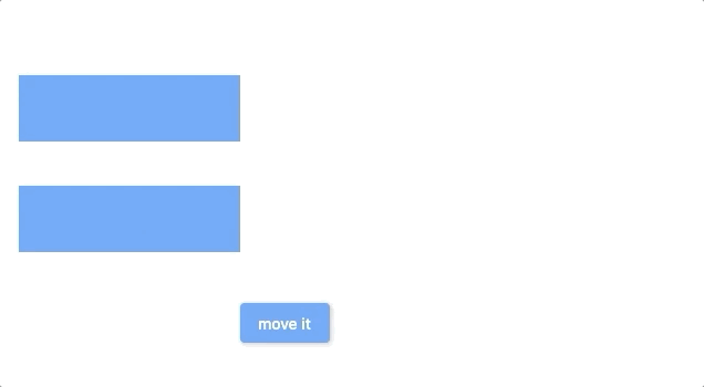
Below you can see a custom curve. After creating my curve, all I needed to do was replace the curve: Curves.bounceOut, with my new curve class, which is curve: DiscreteCurve(),.
class DiscreteCurve extends Curve {
 const DiscreteCurve();

 @override
 double transformInternal(double t) {
   return t - (t % 0.1);
 }
}
As you can see, the mathematical equation is doing nothing more than changing the resulting value with incremental steps. All it takes is then a simple mathematical expression and a small amount of code, and we have the desired effect. It seems as though you can build your own “Snake” in Flutter with ease, doesn’t it?
Want to know how to make a mobile app using Flutter? 🤔 Check out the Norma Precision case study!
Custom Implicit animations
So, we talked about the curves and how to customize them. Before we dive into the explicit animations, it is important to talk about the custom implicit animations.
However, it pays off to remember that built-in implicit animations won’t always provide the effect you are after. No worries, though! There are highly customizable components in Flutter’s arsenal. Let’s talk about these essentials.
Tweens
A tween represents a range for animations. A curve ranges between 0 and 1, but a Tween can have a custom range. It accepts a wide variety of objects and let’s you interpolate between them easily. For example, here, you have a tween interpolating between 0 and 100.
Tween<double>(
  begin: 0.0,
  end: 100.0,
)
But we can also perform the same operation with particular objects.
Tween<Offset>(
    begin: const Offset(100.0, 150.0),
    end: const Offset(200.0, 300.0),
  ),
Here are the most popular built-in tweens for specific object types:
- AlignmentTween,
- BorderRadiusTween,
- BorderTween,
- BoxConstraintsTween,
- ColorTween,
- DecorationTween,
- EdgeInsetsTween,
- IntTween,
- SizeTween,
- TextStyleTween.
You can find here some more detailed information about tweens. There are also a few more things to mention.
AnimationBuilder is a generic animation widget that accepts a tween and a builder. We can also pass a child widget, which will be incorporated during the pre-built and significantly increase animations’ performance.

AnimatedWidget is very similar to an AnimatedBuilder. Actually, an AnimatedBuilder class extends the AnimatedWidget, with additional builder and child parameters. This tiny widget is mainly used for simple animations or implemented when a Stateless class wants to have animation but doesn’t want to be promoted into a StatefulWidget.
TweenAnimationBuilder widget is a type of hybrid between a builder and an AnimatedWidget. It allows us to define a kind of interpolation (called a “Tween” in Flutter) for the animation and use this interpolation inside a builder method.
By default, a tween is a linear interpolation of “double” data types from the beginning to the end. But there are tons of other tweens that we can already use for different purposes.
- AlignmentTween,
- BorderRadiusTween,
- BorderTween,
- BoxConstraintsTween,
- ColorTween,
- EdgeInsetsTween.
As you can imagine, these tweens accept an associated object rather than “double” variables. The result is an interpolation from one object to another in a given duration.
Here is an example of the ColorTween:
tween: ColorTween(begin: Colors.white, end: Colors.black),
As you can see, it accepts enums from the “Colors” class, and in the TweenAnimatedBuilder it looks like this:
TweenAnimationBuilder(
 tween: ColorTween(begin: Colors.white, end: Colors.red),
 duration: Duration(seconds: 2),
 builder: (BuildContext context, Color color, __) {
   return Container(
     color: color,
   );
 },
),
The result is a container that turns from white to red in 2 seconds.

Here you can find more details about this Tween class.
Explicit animations
While implicit animations cover almost all types of animations in an average app, if you can’t achieve a desired animated effect with them, then you must use explicit animations. An explicit animation is required if your effect relies on user input or if it has repetitive or irregular timing patterns. The idea of making an explicit animation is about managing the interpolation of the variables that we use for managing the effect. For that, we can use custom methods.
Before we go into more detail about it, it is essential to explain a few additional functionalities.
- AnimationController can be considered the engine that generates the subsequent values for our animation, whenever the device is ready. The animation controller must know the range of values and the duration beforehand to work. Since this is an engine, we can also make it stop, reverse, repeat and reset.
- TickerProvider is a Flutter mixin class that is necessary for animation controllers to work. Obviously, this mixin provides a Ticker object.
- Ticker objects can be interpreted as the pages of an animation book that hold a unique image. Each Ticker object has a callback and information about its position in the interpolation. When a Ticker ticks, a TickerProvider sends the Ticker object to the Animation controller. Then the callback runs, and we get the animation’s next frame.
That being said, let’s make a simple animation. Here is a basic widget with an animation controller configured to oscillate between 0 and 1 each half a second.
class AnimationDemo extends StatefulWidget {
 _AnimationDemoState createState() => _AnimationDemoState();
}

class _AnimationDemoState extends State<AnimationDemo> with TickerProviderStateMixin {
 AnimationController _controller;

 //Here we configure the animation controller
 void initState() {
   super.initState();
   _controller = AnimationController(
     vsync: this,
     duration: Duration(milliseconds: 500),
     lowerBound: 0,
     upperBound: 1,
   );

   //We want the motion to be both sided
   _controller.repeat(reverse: true);

   //Adding a listener to set the state is needed
   //if your widget tree needs to rebuild in each tick
   _controller.addListener(() {
     setState(() {});
   });
 }

 //Don't forget to dispose a controller, once the widget is no longer visible
 @override
 void dispose() {
   _controller.dispose();
   super.dispose();
 }

 //I use the controller value directly as a parameter to a painter widget
 @override
 Widget build(BuildContext context) {
   return CustomPaint(
     painter: DemoPainter(angle: _controller.value),
   );
 }
}
Once the main widget is ready, let’s add a child widget that will use the value from the controller.
class DemoPainter extends CustomPainter {
 final double angle;

 DemoPainter({this.angle = 0});

 @override
 void paint(Canvas canvas, Size size) {
   //Painters aren't our topic in this article,
   //but briefly it draws 2 mirrored arcs by calculating the sweep angle
   Paint paint = Paint()..color = Colors.blue;
   canvas.drawArc(
     Rect.fromCenter(
       center: Offset(size.height / 2, size.width / 2),
       height: 300,
       width: 300,
     ),
     pi / 4 * angle,
     pi - pi / 4 * angle,
     true,
     paint,
   );
   canvas.drawArc(
     Rect.fromCenter(
       center: Offset(size.height / 2, size.width / 2),
       height: 300,
       width: 300,
     ),
     -pi / 4 * angle,
     -pi + pi / 4 * angle,
     true,
     paint,
   );
 }

 @override
 bool shouldRepaint(CustomPainter oldDelegate) => true;
}
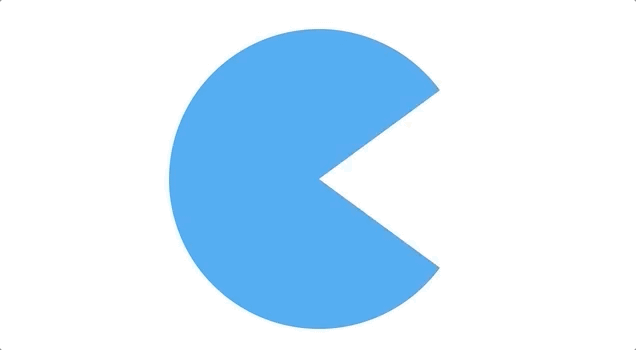
The result is as follows:
Staggered animations
So, what if you need a combination of animations within the same widget? You can achieve it with staggered animations. It seems like we gradually go deeper and talk about more complex parts of Flutter animations. But bear with me, this part is both important and useful.
Staggered animations use the same controller, but they are, in fact, separate animations. Each one has its duration and curve, but we need to use Intervals instead of Durations to run animations sequentially. Additionally, the animations may overlap. Let’s take a look at a Tween with an interval.
I modified the previous ChoreographerWidget to provide a few more values for our staggered animation.
class ChoreographerWidget extends StatelessWidget {
 final Animation<double> angle;
 final Animation<double> controller;
 final Animation<Offset> offset;
 final Animation<Offset> offset2;
 final Animation<Offset> offset3;

 //I added 3 small circles which will change position during the animation,
 // they all start and end at the same positions
 // therefore it makes sense to define constant offsets
 static const Offset startingOffset = const Offset(300, 0);
 static const Offset endingOffset = const Offset(-25, 0);

 ChoreographerWidget({Key key, this.controller})
     //this time the angle value is between 0 and 3
     : angle = Tween<double>(
         begin: 0,
         end: 3,
       ).animate(
         CurvedAnimation(
           parent: controller,
           curve: Interval(
             0.0,
             1.0,
             curve: Curves.linear,
           ),
         ),
       ),
       //Offsets are using our `DiscreteCurve` which we created a few paragraph before
       offset = Tween<Offset>(
         begin: startingOffset,
         end: endingOffset,
       ).animate(
         CurvedAnimation(
           parent: controller,
           curve: Interval(
             0.0,
             0.35,
             curve: DiscreteCurve(),
           ),
         ),
       ),
       offset2 = Tween<Offset>(
         begin: startingOffset,
         end: endingOffset,
       ).animate(
         CurvedAnimation(
           parent: controller,
           curve: Interval(
             0.3,
             0.7,
             curve: DiscreteCurve(),
           ),
         ),
       ),
       offset3 = Tween<Offset>(
         begin: startingOffset,
         end: endingOffset,
       ).animate(
         CurvedAnimation(
           parent: controller,
           curve: Interval(
             0.65,
             1.0,
             curve: DiscreteCurve(),
           ),
         ),
       );

 @override
 Widget build(BuildContext context) {
   return CustomPaint(
     painter: DemoPainter(
       //Here I added a small calculation in order to make the angle oscillate
       angle: (angle.value - angle.value.round()).abs() * 2,
       offset: offset.value,
       offset2: offset2.value,
       offset3: offset3.value,
       startingOffset: startingOffset,
     ),
   );
 }
}
Then our paint will take a new shape:
DemoPainter({
   this.angle,
   this.offset,
   this.offset2,
   this.offset3,
   this.startingOffset,
 });

 @override
 void paint(Canvas canvas, Size size) {
   Paint paint = Paint()..color = Colors.yellow;
   canvas.drawArc(
     Rect.fromCenter(
       center: Offset(size.height / 2, size.width / 2),
       height: 300,
       width: 300,
     ),
     pi / 4 * angle,
     pi - pi / 4 * angle,
     true,
     paint,
   );
   canvas.drawArc(
     Rect.fromCenter(
       center: Offset(size.height / 2, size.width / 2),
       height: 300,
       width: 300,
     ),
     -pi / 4 * angle,
     -pi + pi / 4 * angle,
     true,
     paint,
   );
   canvas.drawCircle(
     offset,
     25,
     paint,
   );
   canvas.drawCircle(
     offset2,
     25,
     paint,
   );
   canvas.drawCircle(
     offset3,
     25,
     paint,
   );
   canvas.drawCircle(
     startingOffset,
     25,
     paint,
   );
 }

 @override
 bool shouldRepaint(CustomPainter oldDelegate) => true;
}
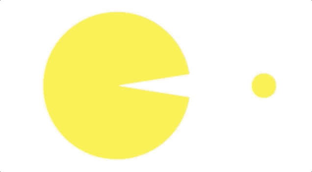
After these changes, our animation looks like this:
I must admit, Staggered Animations are generally relatively easy. However, the hard part is to figure out how the motion works with the given controller and intervals. It is also remarkable that we can use our custom curves for explicit animations to get a different look.
Want to create a mobile app in Flutter with animations? ➡️ Get inspired by the Ginny app for parking management!
Performance concerns
Before we finish, there is one last thing that everyone should be concerned about, namely the performance. Of course, everybody should follow the performance best practices and tips for rendering performance. However, what can be done specifically about animations in this regard?
Make sure to follow best practices
First and foremost, inspect the existing code in terms of the Flutter best practices, for example, adding "const" keywords whenever possible or always disposing of controllers. While increasing the overall performance of the app, this will make the animations perform better.
Use "setState" wisely
I must say, all the examples in this article use the setState method to animate widgets. While this is the easiest and most familiar way to make animations work, it brings the cost of rebuilding the whole widget tree included in the `build` method.
Let’s say we use a StatefulWidget for our animation:
class _AnimationDemoState extends State<AnimationDemo>
   with TickerProviderStateMixin {
 AnimationController _controller;

 void initState() {
   super.initState();
   _controller = AnimationController(
     vsync: this,
     duration: Duration(seconds: 2),
   );

   _controller.forward();
   _controller.addListener(() {
     setState(() {});
   });
 }

 @override
 void dispose() {
   _controller.dispose();
   super.dispose();
 }

 @override
 Widget build(BuildContext context) {
   return Column(
     children: [
       NonAnimatedWidget(),
       ChoreographerWidget(controller: _controller),
     ],
   );
 }
}
Our widget includes the ChoreographerWidget widget, which is the animation itself, and a NonAnimatedWidget that is not a part of our animation. With such a `build` method, given, the statistics for the widget rebuild shows us:
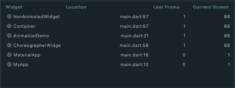
You can see that even our NonAnimatedWidget got rebuilt 88 times.
We can get away with simple examples like the ones we had in this article. However, if the widget tree is large, we might want to rebuild only the necessary widgets and avoid rebuilding everything else using a different solution.
- Using AnimatedBuilder instead of "setState", will help us rebuild only the animation itself. So, our "build" method would look in the following way:
@override
Widget build(BuildContext context) {
 return Column(
   children: [
     NonAnimatedWidget(),
     AnimatedBuilder(
       animation: _controller,
       child: Container(
         child: const Center(
           child: Text('I am a placeholder here'),
         ),
       ),
       builder: (BuildContext context, Widget child) {
         return ChoreographerWidget(controller: _controller);
       },
     ),
   ],
 );
}
This build method leads to quite a minimum widget rebuild, as you can see below:
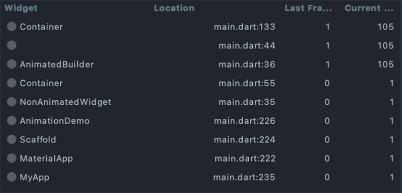
Also, pay attention to the fact that previously we had 88 rebuilds, while now we have 105. As a result, our animation runs more frames per given time frame.
- Splitting widgets in a better way so that our StatefulWidget widgets will only have animation elements that need rebuilding anyway. Since we won’t keep anything additional, the "setState" method won’t rebuild anything unnecessary.
In this example, I moved the `NonAnimatedWidget` and the Column that surrounds it to a higher level in the app’s widget tree. So, this is the new “build” method.
@override
Widget build(BuildContext context) {
 return ChoreographerWidget(controller: _controller);
}
You can see the final result here:
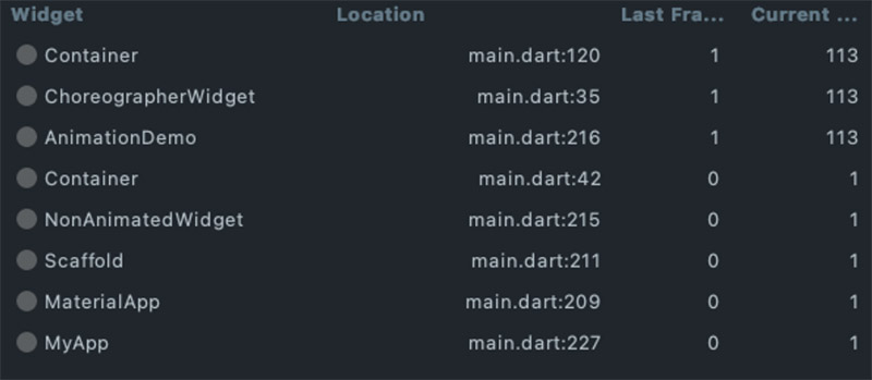
We have 113 frames displayed. Actually, it is even better than with the AnimatedBuilder.
Wondering how to solve performance-related and other problems in mobile apps? Check out our article on mobile development challenges!
Many good built-in widgets
Flutter already has a lot of built-in animated widgets. These widgets are great whenever we need simple animations because they require less time to implement, reduce the code complexity, and have optimum performance. We already mentioned a quite long list of built-in widgets in this article. All you have to do is browse and find the best one fitting your needs.
On the lookout for more Flutter-related insights? Check out this article about responsive design!
Conclusion
In summary, implicit animations in Flutter allow you to introduce animations with a minimum boilerplate, providing you with the possibility to customize. This flexibility is necessary when you need to prevent your widgets from bloating. For custom needs, you have tons of options like explicit animations, custom curves, staggered animations, and some more possibilities that we didn’t cover in this article.
It was a long read. However, there were a lot of valuable topics to cover here, too. I can confidently say that Flutter provides a multitude of options for animations, together with the built-in functionalities that will save your beacon in upcoming deadlines. Good luck with your Flutter projects!
📙 Recommended further reading:
- Cross-platform mobile development 2022: trends and frameworks
- Flutter vs React Native - which is better for your app? (Update)
- 7 ways in which cross-platform app development supports your FinTech
- Is Flutter a good choice for startups?
- How not to run out of money in the middle of mobile software development?
Looking for an opportunity to use Flutter at work? Join our smashing dev team!


Navigate the changing IT landscape
Some highlighted content that we want to draw attention to to link to our other resources. It usually contains a link .
.svg)
.svg)
.svg)
.avif)
.avif)
.avif)
.avif)